
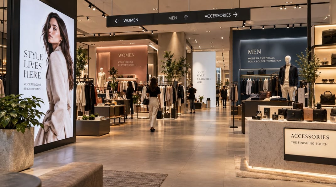

Walk into a store, showroom, hotel, or office and notice your first impression. Before someone can talk to you, a large sign, product wall, bright graphic, or clear reception area can make a difference. Studies of environmental design document that the physical environment can influence customer reactions such as perceptions of the business and service.
A helpful display answers three questions for visitors: Where am I? What is the value of this business? Where else should I find information?
What catches the eye is related to size, contrast, light, images, and layout. The display should complement the space and not take up all the wall. It’s often easier to pick up a simple visual message than several competing ones.
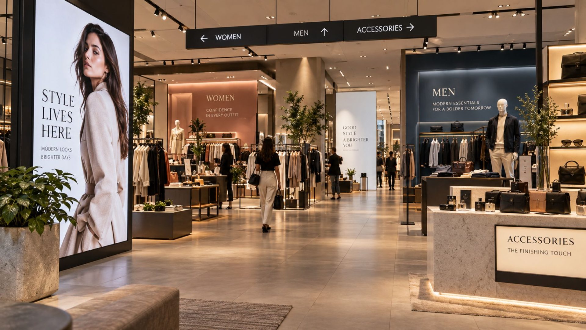
How Displays Guide Customers Through a Space
A commercial space should make movement easy. Customers need to find products, service desks, fitting rooms, reception areas, or exits without having to stop and search for signs. Visual displays can support this process by creating clear reference points.
The position of a display matters as much as its design. A sign placed near an entrance can introduce a product area. A wall graphic can mark a service zone. A lighted display can draw attention to a key section when the surrounding area has less visual contrast.
例如 SEG lightboxes can place a large, bright graphic on a wall or within a display structure. This can help define a brand area while also giving customers a clear visual point to notice.
Good planning starts with the customer path. Ask:
- What should visitors see first?
- Where should they go next?
- Which information do they need before making a choice?
- Where could they become confused?
The answers help determine the size, position, and number of displays. Too many signs can create visual noise and make navigation harder, so each display should have a specific job.
How Light and Color Change the Look of Commercial Spaces
Using light and color appropriately can improve a commercial space and make visual messaging easier to read. They should be designed in conjunction with the function of the area, the amount of daylight available, and the information being displayed.
The use of light as a visual tool.
Backlit displays are based on the principle that light is shone behind a printed or translucent graphic. This results in a bright image that is distinguishable from adjacent surfaces. They can be valuable in retail stores, showrooms, reception areas, exhibition booths, and other locations that need a visual focal point.
However, light level is important. A display that’s much brighter than its surroundings can draw attention to itself quickly; one that’s poorly positioned can lead to glare or difficulty in reading content nearby. The purpose is to be easily seen, not to be glowing.
Color and Contrast
Color can also help to differentiate sections and make text or graphics more salient. Contrast is a key factor. Web Content Accessibility Guidelines (WCAG) suggest that, in most situations, the contrast ratio for normal text is a minimum of 4.5:1, and for large text, it is a minimum of 3:1. The principle also works well with physical signs: text should be easily differentiated from the background.
Brand colors can also tie a physical location to other points of contact with the customer. The same colors can be used throughout a company’s website, packaging, signs, wall graphics and displays. But using color in isolation to impart vital information is inappropriate. Color should not be the sole means of identifying or communicating something when accessibility is needed, according to the U.S. Access Board.
The best combination can be achieved by balancing these factors: sufficient light for the display of the message, sufficient contrast for the readability of the message, and sufficient space for consumers to perceive the message.
How Brand Displays Create a Consistent Customer Experience
A customer may see a company on a website before visiting its store, showroom, office, or event booth. If the visual style changes at every step, the connection between those experiences becomes less clear. A consistent brand display helps customers recognize that the same company is behind each contact point.
Consistency can cover the logo, main colors, fonts, image style, graphic shapes, and layout rules. It doesn’t mean that every display must look identical. A wall graphic and a website have different formats, but both can use the same brand system.
This approach also makes future design work easier. Once a company has clear rules, teams can create signs, banners, displays, and digital content without making every choice from the start.
For commercial spaces, useful brand elements include:
- a fixed color set;
- approved logo versions;
- consistent typefaces;
- a clear image style;
- defined spacing and layout rules.
When these elements stay consistent, customers can more easily connect separate experiences with one company.
How Visual Displays Help Customers Understand Products and Services
A display should respond to a specific customer question. What is this product? What does it do? Why should I bother to take a look at it? Where can I find out more?
Large images can present a product in use, and the brief text can tell about its primary feature. Signs can help to segment products. A wall panel can be used to convey a service without having to read a lengthy page.
Order is important in informational. A simple structure for a useful display:
- Main message — explain to visitors what they are viewing.
- Key detail — describe the main product or service characteristic.
- Giving information — give facts that assist the customer in making a decision.
- Next step — demonstrate where to find help to ask a question, scan a code, or see the product.
This will also benefit staff. When basic information is already displayed, employees can get down to the specifics of what the customer needs to know without having to repeat a basic introduction.
When there are numerous products in a space, it’s the visual clarity that comes in handy. The use of colors, images, signs, and display areas can form clear groups, facilitating the comparison of options for visitors without losing themselves.
How Displays Support Different Types of Commercial Spaces
Each commercial space requires a different format of displays as customers have different objectives. Wall graphics, product signs, and lighted displays can define product sections and highlight products in retail stores. Having a room with large images and product panels in the showroom can be used to explain features to customers as they view them in person.
In an office setting, a brand-name reception wall and signage can help identify the business and direct visitors to the appropriate area. At trade shows, large graphics that will be seen from a distance may be required. Fabric displays, lightboxes, and modular booth systems are great solutions for establishing an effective brand area in a crowded exhibit hall. The display must always be congruent with the space, customer path, and the information needed by visitors, and where the information is.